
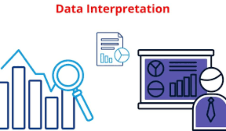
Data Interpretation (DI) is one of the highest-scoring sections in competitive exams like IBPS, SBI, RBI, SSC, and Railways. It tests your ability to read, understand, and analyze data presented visually. Among all DI types, Line Graphs and Bar Graphs are the most common and easiest to interpret, making them perfect for beginners.
What Is Data Interpretation (DI)?
Data Interpretation involves analyzing numerical data presented through charts, graphs, or tables and answering questions based on them. It checks your observation skills, calculation ability, and decision-making speed. DI becomes easy once you learn how to read graphs and identify patterns quickly.
Bar Graph– Basics for Beginners
A Bar Graph uses rectangular bars to represent data visually, making it one of the simplest and most effective tools for comparison. Each bar represents a category, and the height or length of the bar indicates the value of that category. Bar Graphs can be vertical or horizontal, but the purpose remains the same to help you compare values quickly. They are widely used in exams because the data is easy to read, and most answers can be found just by observing the bars without heavy calculations. Bar Graphs are especially helpful when comparing performance, sales, population, production, or any data across different groups or time periods.
Where Bar Graphs Are Used:
- Comparing two or more items
- Showing year-wise or category-wise performance
- Understanding highest or lowest values
- Identifying quick differences between data sets
How to Read a Bar Graph:
- Check the title, labels, and units
- Notice the height/length of each bar
- Compare bars to find differences or ratios
- Look at the scale on the axes
Note: Bar Graphs are simple and ideal for beginners because values can be compared visually without complex calculations.
Line Graph– Basics for Beginners
A Line Graph connects individual data points with straight lines to show how a value changes over a period of time. It is most useful for identifying trends such as gradual increase, steady decline, or irregular fluctuations. The X-axis usually represents time (days, months, years), while the Y-axis represents the value being measured. Line Graphs can display one or multiple lines, allowing easy comparison between two or more categories. They help you quickly understand long-term patterns, spot sudden jumps or drops, and analyze overall movement at a glance. Because of their clarity and simplicity, Line Graphs are heavily used in exams to test interpretation skills without complex calculations.
Where Line Graphs Are Used:
- Monthly or yearly trends
- Sales or production growth
- Population or demand changes
- Temperature or weather patterns
How to Read a Line Graph:
- Identify each line and its markers
- Observe the X-axis (time) and Y-axis (value)
- Note rising and falling trends
- Compare two or more lines when needed
Note: Line Graphs clearly show progress or decline and help identify patterns quickly.

How to Solve DI (Line/Bar Graph) Questions
Data Interpretation questions based on line and bar graphs require a clear reading of values and a systematic calculation approach. With regular practice, candidates can learn to identify trends quickly and avoid time-consuming mistakes.
- Start by carefully reading the title, units, and scale of the graph before looking at the questions.
- Note down key values and comparisons to avoid repeatedly referring back to the graph.
- Simplify calculations by using approximation where exact values are not mandatory.
- Solve easier questions first, such as direct value-based or difference-based questions.
- Keep an eye on time, as DI sets can become lengthy if approached without a plan.
Common Question Types of DI
Understanding the common patterns asked in DI helps candidates prepare more effectively and improve speed. These question types frequently appear in banking and insurance exams.
- Direct value-based questions asking for specific data points from the graph.
- Comparison questions involving an increase or decrease between two years or categories.
- Percentage-based questions focusing on growth, decline, or contribution.
- Ratio and average-based questions require multi-step calculations.
- Trend analysis questions that ask candidates to identify the highest, lowest, or overall movement.
Why DI (Line/ Bar Charts) Is Scoring
Data Interpretation questions based on line and bar charts are considered highly scoring because they rely more on calculation skills than complex logic. With the right approach and regular practice, candidates can secure maximum marks from this section in a limited time.
- Questions are usually direct and based on clearly presented numerical data.
- Line and bar charts follow predictable patterns, reducing surprise elements.
- Many questions can be solved using approximation, saving valuable time.
- Practising similar sets improves familiarity and boosts calculation speed.
- Accuracy remains high as long as values are read carefully from the chart.

 Bank of Baroda LBO Final Result 2026 Out...
 SEBI Grade A Phase 2 Result 2026 Out at ...
 PNB Apprentices Result 2026 Out at pnb.b...